Today, we will run through Five Tips on How to Build the Best About Me Page Possible.
The truth is that About me pages are almost always one of the most visited pages on any website.
They’re incredibly important because your audience cares to know who you are and wants to be able to relate to you, or know who they are dealing with if it is a business about page.
They love seeing the face behind the blog or business!
So my question is…
When they see so much traffic, why are most “About Me” pages so BORING?
You might also like:
Table of Contents
Heres how to write an about me page

Your About page is the soul of your site.
And, while there’s no perfect recipe for success, there are certain elements that all winning About pages share and that you need to consider if you want to write a good one.
I’ve got five pro tips to help you build the best About page you possibly can…
1. Make the page grab attention

There’s no one way to go about this, but I have a few tricks up my sleeve that might help you spice up your About page.
One of the best and easiest methods is to open your “About Me” with a punchy statement that perfectly captures what your attitude and style—the things that make you, well—you!
Nothing hooks in a reader like a bold, benefit-driven headline.
Your readers already know this is your About page—they clicked on the link.
So instead of repeating that information back at them with a boring “About Me” header, try opening with something really interesting or unexpected.

Before we move on,..
Want some handy tips to help you plan your site and avoid newbie mistakes?
Join our FREE Video Blogging Course below!
Another great strategy is to include pictures and videos. Photos add a nice personable touch, while prescriptive videos describing your process and/or snapshots behind the curtain of how a product is made go a long way towards consolidating reader trust.
Don’t underestimate these humanizing touches. If you’re always pushing your sales pitch, you may drive customers away.
People want to know that there’s a human running the site and that the person behind the blog is someone worth paying attention to.
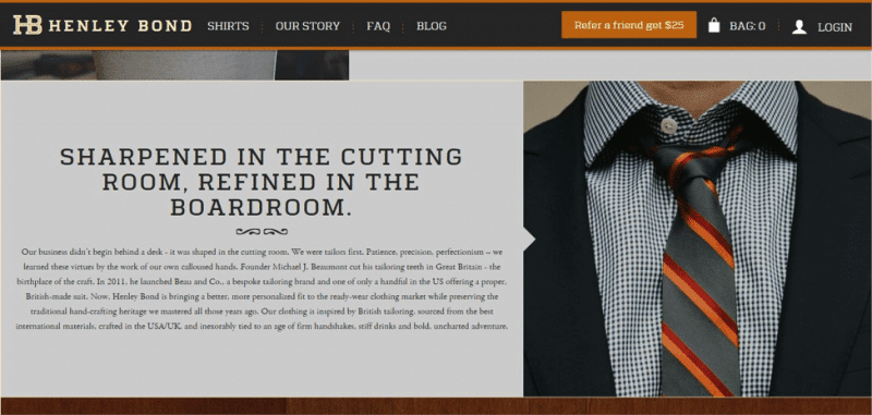
One of the best About me examples of this I found is Henley Bond’s bold showcasing of its designer shirts.
They show off their product with a picture, provide a little company background, and wrap up the whole thing with their catchy slogans: “Confidence changes everything” and “Sharpened in the cutting room, refined in the boardroom.”
Now that’s a sharp looking About page!

Of course, another thing your About page—along with EVERY other piece of content on your site, including your homepage and landing page—should include, is a call to action.
A call to action (CTA) directs your readers on where to go next.
Maybe this is a button urging your readers to opt-in to a newsletter, to keep them informed on all of your exciting developments.
Maybe it directs them to a product page.
Or maybe your CTA links your readers to your most popular posts.
Whatever your CTA’s purpose, it’s a very important element of your About me template. Don’t gamble on your reader sticking around once they’ve scrolled to the bottom of your page—give them a reason to keep exploring your content!
2. Show samples of social proof about yourself
Nothing boosts your credibility like a good testimonial or two and I know this might feel like bragging (yuck), but trust me—hearing positive feedback straight from your customers goes a lot further than tooting your own horn when it comes to convincing your audience that you’re credible.
This is especially important if you’re angling to sell something.
Your customers are looking for reasons to trust you, and stories about positive experiences and/or links to relevant case studies will establish you as an authority in your field.
Give your readers a reason to turn to you over the other guy.
Obviously trust and winning testimonials are earned over time, though. Don’t fake these credentials if you don’t already have them—you may wind up harming your reputation instead of helping it.
3. Paint an honest picture in your template
A short bio and a nice photograph help your readers connect with the wizard behind the curtain and get a good look at the real you—but it’s got to be HONEST.
I usually do this by opening up about my passions and you should too because you want to communicate to people that your about page isn’t just who you are and what you do—but WHY you do it.
This is a great place to share your values with your customer by elaborating a little on what you believe and why you launched your website in the first place. One popular way of doing this is telling a story your audience can see themselves in.
Also, you’d think this goes without saying, but be yourself.
Getting Google traffic is great, and there’s nothing wrong with including some organic SEO phrases that tie naturally into your industry, but all the SEO in the world won’t help you if you sound like a robot.
Write the way you talk—in plain English.
You also want to be open about your credentials—this is no time for modesty!
Your readers are looking for a reason to turn to you over your competitors, so you need to sell your accolades with no holds barred.
List your relevant achievements and tell your customers exactly why you’re the best person for the job.
But as you try to do all of this, remember to keep it short.
While it’s important to impress your readers with your merits, nobody likes a narcissist or a never ending ramble.
Which reminds me…
4. Keep your scope narrow and relevant
Your About me page is NOT your autobiography. And, you may be surprised to hear this, but it might also not be the place to share your company’s longwinded professional history.
Some companies thrive on tales of their long lineage—fine Scotch distilleries or upscale clothing companies, for example.
That’s fine.
The problem is that a detailed history doesn’t always add to a company’s image—sometimes it’s just a snore.
This is a common mistake—so much so, that some companies even neglect to address their customers’ problems or include anything like a call to action, because they’re so absorbed in their personal narrative.
The bottom line is…
Unless your history builds up an interesting story of where you are now, or is a story your audience can relate to—DON’T BOTHER.
There’re two important factors, when keeping your message relevant and to the point: know your audience and emphasize your unique selling points (USP).
Your unique selling points are what help you drive leads—they’re the little details that set you apart from your competitors and make you the single, best solution your readers could have stumbled upon.
Highlight these points—your readers want to hear them!
And, of course, knowing your audience is key to any piece of content you publish—so don’t lose that target just because you’re writing an “About Me” page.
Address your audience and explain why you and your mission are so important to them.
Lastly…
5. It's called an About Me page, but it's really about THEM
I’ve saved the most important point for last, because if you take anything from this post, I hope it’s this: your content—yes, even your “About Me”—should build empathy with your customer.
It sounds nuts, but your customers are looking to see themselves in your mission statement—they want to understand what kind of problems you solve and how they fit into the solutions you offer.
Remember this: your readers aren’t stumbling onto your site blindly—they’re coming to you with pain points that you can solve.
When they click your About page, they’re usually not after your entire back story, what they really want is to know what you have to offer them.
The About page must show how you can solve their problems.

Your customers are also looking for you to anticipate and address any objections they might have. Maybe they’re not convinced that your product is the best fit, or maybe they wonder if a competitor—another blog, perhaps?—would be more useful.
The last thing you want is for those problems to remain unresolved when they leave.
There’s multiple solutions for this—your credentials might put their mind at ease, or perhaps a story of your greatest success builds their confidence. Others might be inspired by the user testimonials I mentioned earlier.
In my case, I list off my experience and then drop a line for my readers to contact me with any questions I might have missed—it’s a simple option, but surprisingly effective!
About me pages: final thoughts & ideas
The last, and final trick is to wrap all of these elements up into a simple, minimalist About page. Your readers don’t want to wade through a wall of text just to learn your mission statement.
Sounds impossible?
Well, again, there’s no one strategy, but when I write my About Me pages, I like to address three simple questions:

- Who? My About me page needs to tell my readers who I am, and why that matters. When people see that I have years of experience, or that I juggle numerous blogs and hundreds of thousands of visitors, it translates into more credibility with my readers, and thus more stock in my advice.
- What? It’s super important that my About page tells my readers exactly what I’m about. This is my call to action—offering to help my readers break into the blogosphere and start writing like a pro.
- Why? I want my readers to understand my stake in this process, and understand that I kicked off StartBloggingOnline.com in 2013 to address the needs I saw for some reliable, actionable advice.
As long as I answer each of these questions when I write about myself, and ALWAYS remember that I’m writing an About Me for my readers, I think I’ve got a winning formula.
If you want some more advice, I’m a big fan of Rachel MacDonald’s and Eric Siu‘s articles on writing compelling About pages, along with this Blog Tyrant list that runs through some excellent About Me sample pages which will give you even more About Me ideas.
So how does your page stack up against my about me blog examples? Do you have any favorite websites, with features that I missed? Let me know in the comments below!

Our #1 Choice For Hosting Blogs
62% Off Exclusive Offer Applied at Checkout
Regularly
$6.95/mo
Starting From
$2.64/mo*
- Free 1 Year Domain Registration on Select Plans
- FREE SSL Certificate
- Drag-and-drop Website Builder
- E-commerce Ready
- 1-Click WordPress Installation

Related articles:
FAQs
How do you write an About Me bio?
What do you write in an about page?

